Inspo for Valentine’s day!
However you decide to spend your Valentine’s Day get your inspiration here so you can look good while doing it!
So let’s get into a few different looks one could try out for Valentine’s Day, and we can start with a few less obviously themed styles.
This first one is my favorite. It’s not the usual pink eyeshadow or red lip that I think most of us would jump to for this holiday. I also love that it could be worn with a variety of other colors. This look would look gorgeous with a red dress! It feels more purple than pink and I love this on brown skin!
-artist unknown
A moody marroon look is another gorgeous choice I don’t think I would come up with on my own. A hint of red with this look but still feels neutral and sultry but not over powering.
@RyanDestiny
Moving on to the more classic looks the infallible red lip can be worn in many forms! It’s easy, it’s always appropriate, and it speaks for itself.
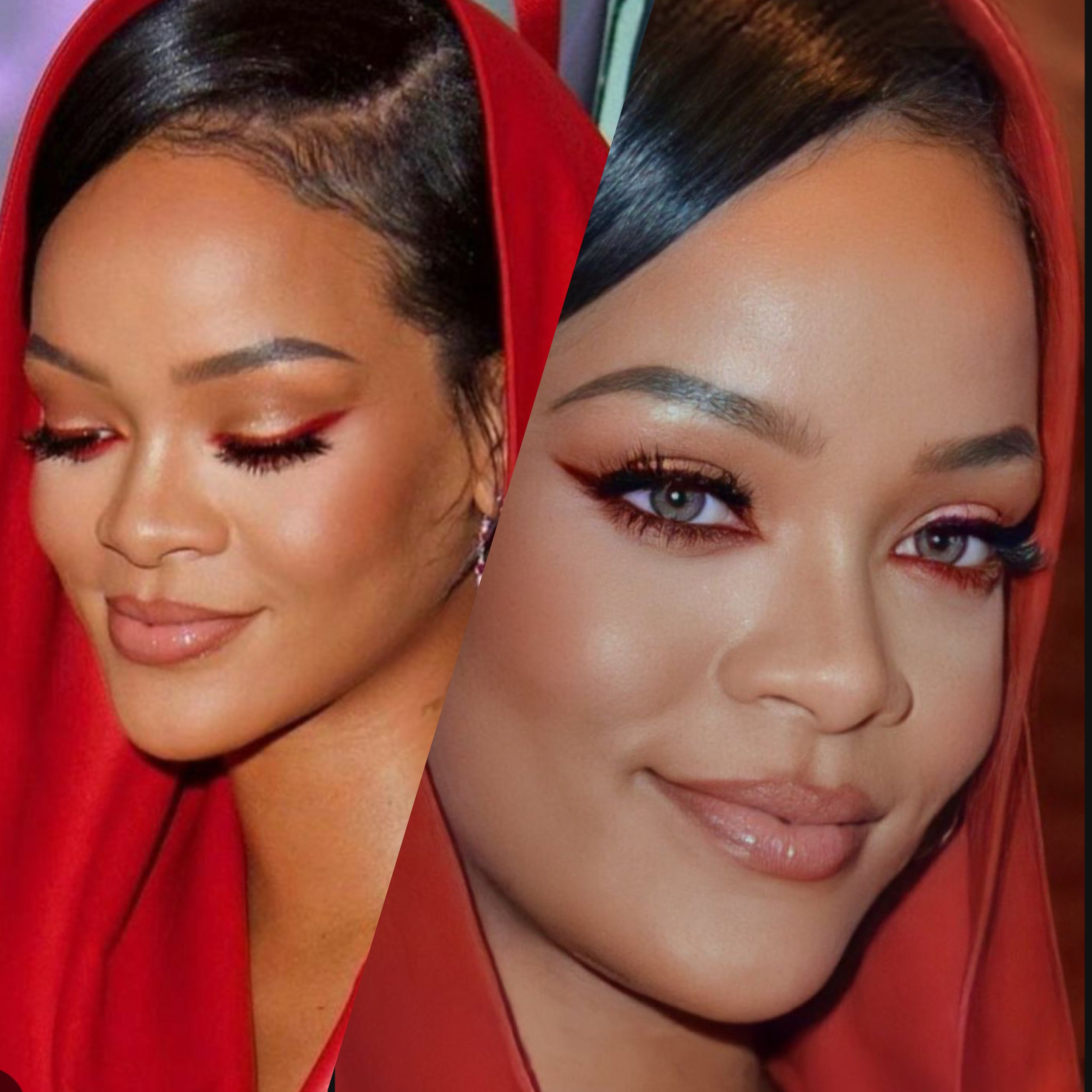
These last two looks feel bolder, a little bit artsy even…
I love this look by Rihanna, I’m easily impressed by anything she does and I looked at this pic and felt like she must be the person to ever wear red eyeliner! How is it that the liner is such a statement piece for this makeup but it doesn’t feel theatrical and that’s such a hard balance to achieve, and yet she did it.
@badgalriri
Going graphic with your liner can feel like a risk but I feel like that’s always a risk worth taking. A pop of color never hurt anybody! I love that this look feels editorial, yet soft. The eyeliner on the inner corner with the little flower gives avant-garde, the touch of blush paired with the wash of pink is a perfect balance needed to tie this whole look together without making it too eccentric.
@Soukenya
So, how will you be celebrating this Valentine’s Day? I will be in the house, but I’ve been in such a pink girlie pop type mood, that I just might convince myself to get cute and attempt to paint the town red!!
Mocha Mousse 2025 Color of the Year
The decision has been made and the color has been named, Mocha Mousse! It’s an interesting choice, beautiful in tone but a little muted, and a little blah dare I say. I look forward to the announcement..
The decision has been made and the color has been named, Mocha Mousse!
It’s an interesting choice, beautiful in tone but a little muted, and a little blah dare I say. I look forward to the announcement of the color of the year. It can inspire trends for the upcoming seasons and is supposed to “capture the global zeitgeist” as well as “express a global mood and an attitude, reflecting collective desire in the form of a single, distinct hue.”
When I realized there was an official color named each year it was easy to see it pop up throughout the year in all the areas of life where products can be sold. In the spring it can be seen in any ads meant to inspire redecorating, like paint commercials or an ikea ad where the throw pillows match the rug that match an accent wall. In the summer we see the color of the year in nail polishes that match the same color of a cute bikini a few aisles over. And in the fall we definitely see it on the runways, it’s on the coats, the purses, the boots. It’s everywhere and you may have never noticed!
Of course this applies to hair and makeup, I’ve already seen a few TikTok’s of people trying to achieve Mocha Mousse hair.
When picturing how this color could play out in trends makeup-wise, I think this color will translate beautifully on the skin. For blush, eyeshadow, lipstick it’s a neutral enough color that can be worn subtlety as just a hint of color or it’s unique enough to be used as a focal color when made into an eyeliner or a more intense lip.
I haven’t quite made up my mind about this color. On its own it’s pretty, but to be name thee color… it’s a bit disappointing. If the color is meant to encapsulate the mood of the world, which would in turn influence the vibe for the year in various ways then I think Mocha Mousse just ain’t it.
Not get too off topic from beauty and fashion but the world is on fire, literally and figuratively. I don’t even know what my mood has been or will be in 2025. It won’t be a Mocha or Moussey vibe. We need something electric! A color based off a beautiful chartreuse or a vivacious cyan would really get the people going! Something that symbolizes new beginnings and invokes excitement.
Contrast makeup.. what is it?
A few weeks ago I started to see videos circulating on Contrast Makeup. To be honest, I was instantly annoyed, at first glance I was like okayyyyyy so this is just a new variation of people applying soft, medium, and heavy makeup and giving it a new name. We could equate low contrast makeup to a “natural look’, medium contrast would be “soft glam”, and hight contrast is a “full beat.” In a nut shell that is essentially what this is. But! I will say when I read the full description of what the idea behind contrast makeup is, it actually seemed to take a very interesting approach on how we could analyze and decide which makeup look is the most suitable to enhance your natural features… let’s break it down..
First we’ll start with the definition of the word:
Con·trast
noun
1.the state of being strikingly different from something else in juxtaposition or close association
The theory of contrast makeup is that one should look at their skin tone, compare that to the other tones in their features (lashes, brows, eye color, hair color, lip tone, etc) and decide the level of contrast between those to determine the intensity of makeup you should apply to be the most flattering for you. So, if you have a deep skin tone and dark hair that are close in shade, or fair skin and light hair, you’d be a low contrast girly.
The color of your hair and skin tone isn’t what’s important when figuring out your level of contrast, it’s the difference in the levels of shades between your features. We will use Beyonce as an example of the difference.
When Beyonce has blonde eyebrows and a brighter blonde hair color that’s very close in her skin tone, almost the same color, she is low contrast. There isn’t a huge difference in the depth of her features compared to her skin. Contrast makeup then implies that a softer more natural look would be the most flattering. If low contrast is what you need then a look that consists of soft neutrals won’t overwhelm or drown out your features. Think, a natural sun kissed look with a nude lip.
If our queen is showing off a look where her hair and brows are 4-5 levels darker than her skin tone, we are dealing with a medium contrast Bey. Therefore, a makeup look where the makeup has pops of shades that are 4-5 shades lighter and darker than the skin can be easily pulled off.
Looking at her when her hair is a deep chestnut brown or even black, that’s a high contrast in the difference between the skin and her features. With this combo contrast theory states you could wear a bolder look and not have it feel too over powering. A soft smokey eye, with a power blush, and a more noticeable lip. color wouldn’t stand out as much as it would on someone else since your natural features align with a bolder color palette.
I think using this theory of a way to decide what kind of makeup look is best on you is really helpful and a cool way to look at it, but this is by no means a law of makeup! I personally am a medium contrast, my everyday and most flattering look in my opinion is a low contrast look. Although my natural hair color and brows are more of a dark sandy brown, my facial structure is strong af, so I prefer a softer look on me to avoid feeling like my makeup is “harsh” on my face. That’s my own analysis of the way I look, many could agree or disagree, I think you should do whatever makes you feel the most beautiful and take every trend you see with a grain of salt!


